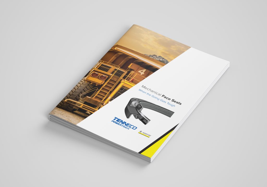
Goetze Industrial Sealing Rings Booklet
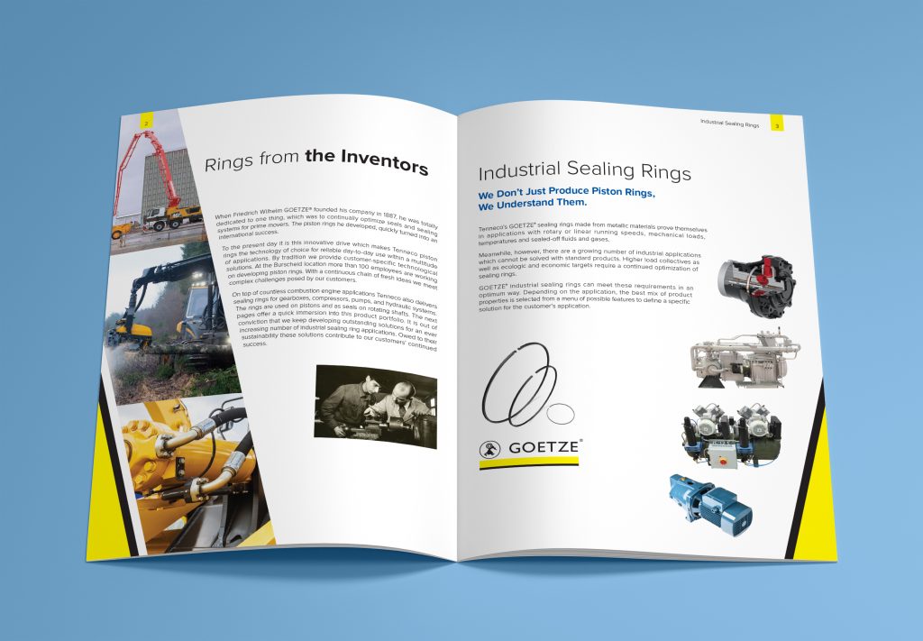
When Tenneco rebranded its Powertrain and Clean Air Divisions, they wanted the two areas to fall under a similar look and feel. Independent in nature, but an obvious visual bond that could be quickly noticed. I worked with our communications team to come to a consensus that the visual identity elements of the “diagonals” would carry over to sub-brands such as Goetze, but the sub-brand would be able to retain their primary colors.
Goetze was the first sub-brand to create pieces within this new visual system, and I feel that the result is a testament to how you can play within a visual sandbox and still make creative pieces that retain a sub-brand’s uniqueness.
- All
- Branding
- Digital
- Logo
- Soccer
- Video